WEEK 5 - Persuasive poster and Lino Prints
Materials:
- lino
- lino tools
- ink
- ink roller
- printing press
Process:
First I drew my design onto the lino and then used the tools to cut out the spaces I wanted to keep white. I used the ink roller to evenly distribute ink over the design and then printed the design by placing the paper on top of the design and running it through the printing press. For the digitally altered design, I used Illustraitor to text color combinations, and then in the collage version I used this color inspiration to find images that I could lay behind the design.
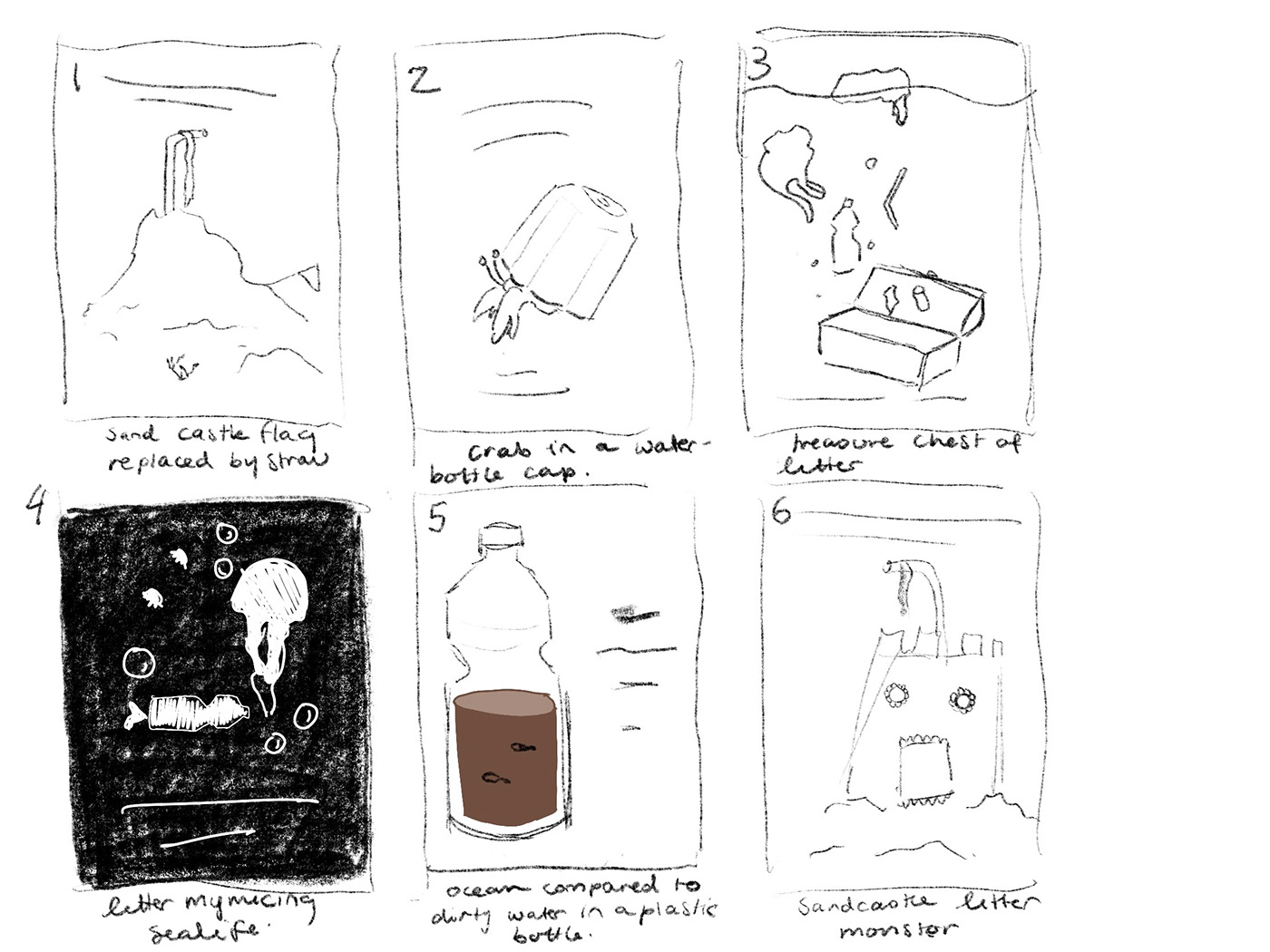
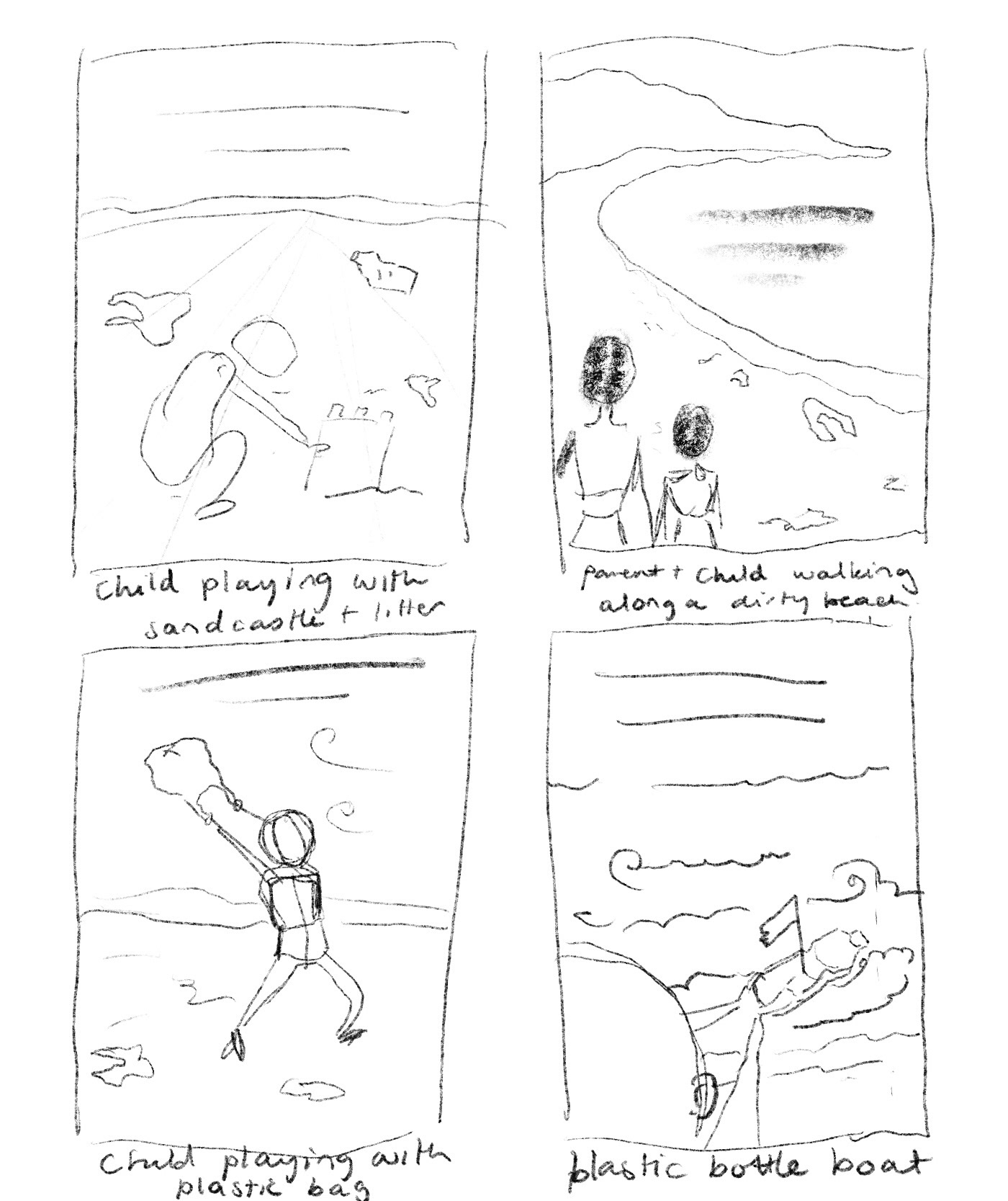
Image 21
Reflection: When developing my designs for my persuasive poster I wanted to use storytelling to discuss the future of the state of the beach. I wanted to keep this idea of innocent children playing on the beach however portray it through a darker lens to appeal to a more mature audience. There is the element of using the 'fear-based' approach of persuasion, however, the subject matter will still be very friendly. For my final poster, I want to take inspiration from images 1, 6, and 7 and utilise symbolism and dark colors to create something that looks quite dystopian.
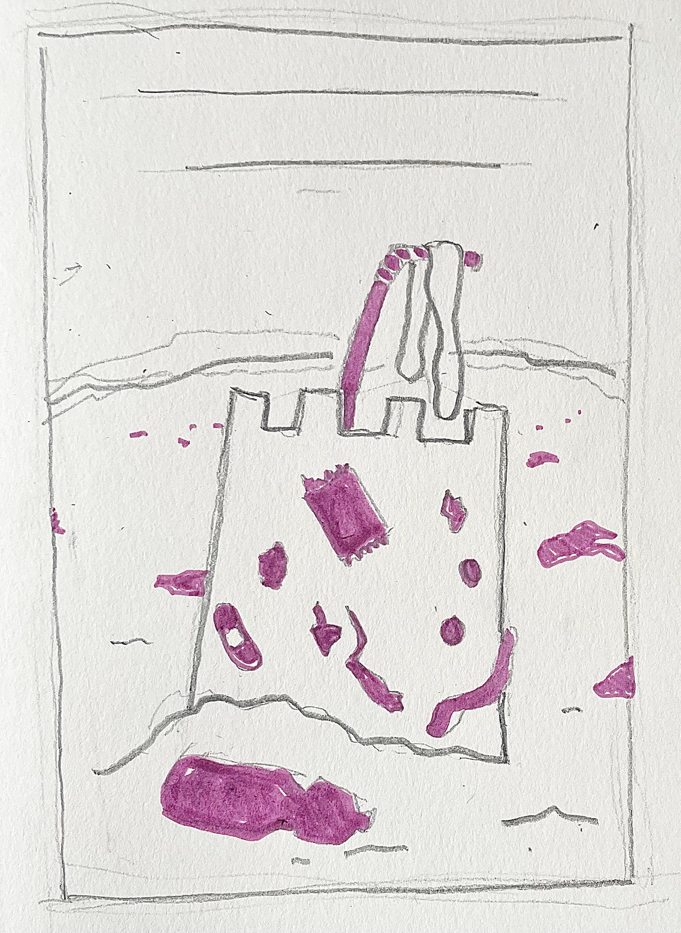
Image 22
Reflection:
In my design, I have depicted a sand castle covered in trash. At the top of the sandcastle is a plastic straw which is meant to resemble a flag at the top of the castle. this highlights the future of beaches in that they have been overtaken and land has been 'claimed' by litter. I want the image to appear very bold and confronting even though the subject matter is quite innocent.

Image 23
Reflection:
I really liked how this Lino print turned out. The only thing I could change would be how much detail is in it. I only had a small lino block to work with which meant that I couldn't carve really small details. This resulted in the rubbish not being as identifiable as i wanted it to be and the overall poster lacking intricacy which I think would have drawn the viewers to it more. The simple black and white color theme is effective as it's very bold and contrasting, making the imagery more confronting. There is a juxtaposition between the style and the subject matter. A sand castle is quite innocent whereas the bold lines and chilling text means that viewers are positioned to view a seemingly innocent scene in a darker tone. I have added to the idea of personifying the litter as something that has overtaken the beach. this is shown in the flag that appeared to crumble off the castle, highlighting the destruction of the beach's beauty.
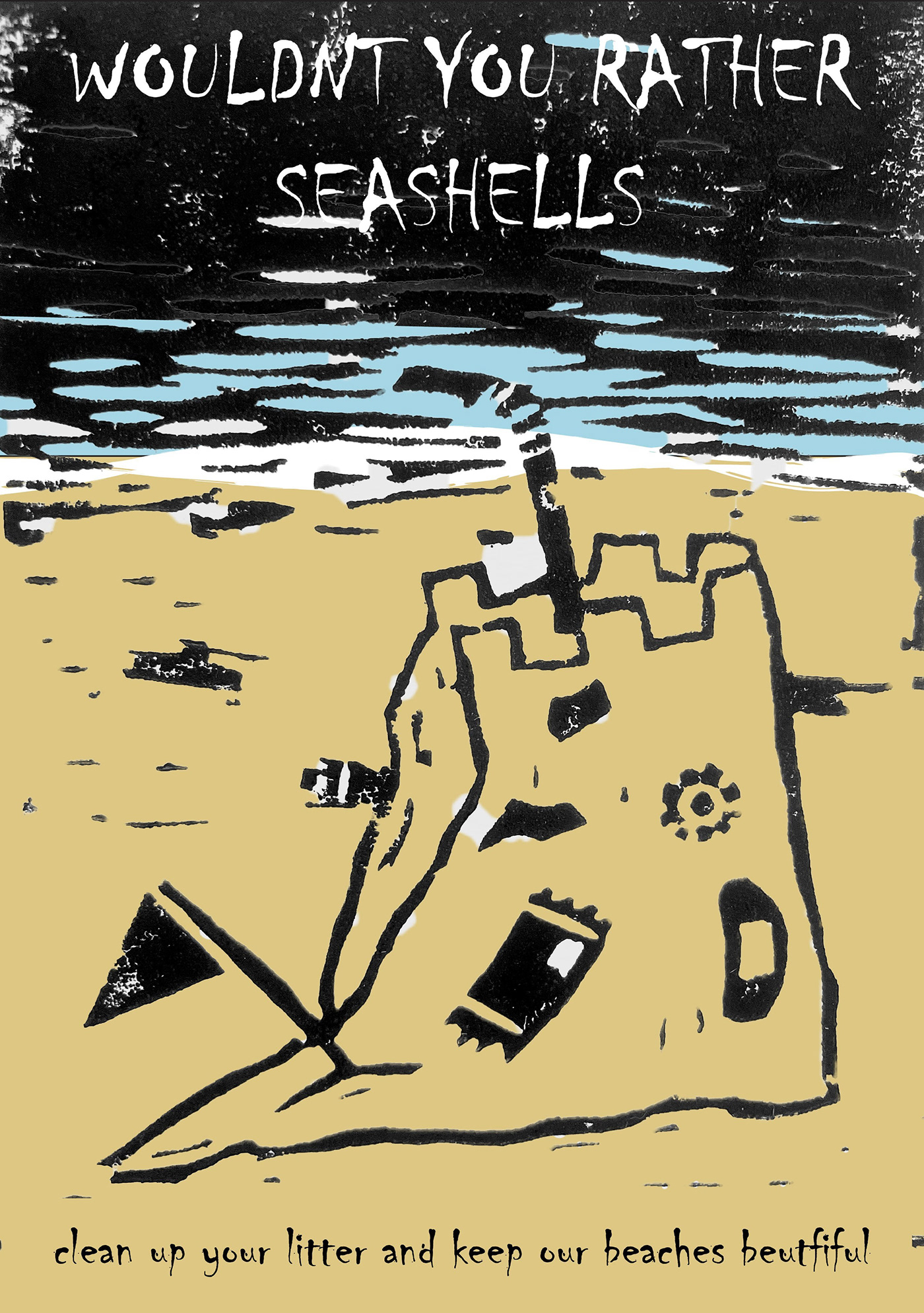
Image 24
Reflection:
I don't like this version of the poster as much as the bold black lines do not work with the dull colours of the poster. there are also white parts of the image where i was unable to remove the background of the Lino print. I think that adding more texture in the coloured parts would assist with the overall aesthetic of the image however i think the meaning is best communicated with no colour at all. This is because it adds too much life to an image that is meant to resemble the aesthetic of a 'Horror' film poster.

Image 25
Reflection:
Although the collage background works with the texture of the black linework, the photo images are too serene compared to the harsh black lines. additionally. The collage takes away from the actual design as attention is drawn to the background from the colors and intricacy. Furthermore, the rubbish is not as prominent as I wanted it to be. My theory behind it was that the rubbish would have a connotation of negativity. I also wanted the water to be black as it resembles an oil spill and shows that there is something dark approaching.

